Thursday, 23 October 2014

Digipak Designs

I have done a design for the back cover of my digipak, this cover has followed my album cover ideas of 'abstract art', and sticking with the idea of sketches of different things (such as the wings and the tiaras on my album cover, and the same on the magazine advert) I have decided to branch out - to things like hands, eyes and lips. These things I think are nice to see sketched, it produces a raw aesthetic and everyone can relate because everyone has these body parts. I think that this will work, because my target audience like things to be natural and not synthetic or artificial, and I feel that with art a rough sketch is the best way to get that across.

Although this is the first design that I did, I really like it. I think that because it is so simple but the gesture can be read to such an extent that it will have a profound effect on my audience. They will appreciate that a lot of work has gone into this design yet it looks so easy and simplistic. I think that the gesture really shows vulnerability, which also follows with the connotations of the colour white where vulnerability and innocence are common themes associated with white. The sketch really stands out on the page, and because it looks so rough I really do believe that my audience will find the aesthetic strong, and powerful. 
Below is the sketch that I copied from google images and the digipak (Rihanna - Loud) that I took inspiration from for the layout and the font style. 


I chose Rihanna's digipak because this album cover was very simple and yet it was a massive hit for the Barbados-born artist. The only thing missing from my own design is the barcode, which I left out originally because I wanted to focus on the design elements first, and then add in the final details once I had come to a decision. 
This is my second design below:

I decided to use lips for this design because I wanted to experiment with different sketches and layouts of the text. This layout was inspired by Florence and the Machine 'Lungs', but instead of sketching lungs I used an image of sketched lips. I also decided to use an image of the person biting their lip, this is because the film 'The Rocky Horror Picture Show' uses a biting lip as their iconic image, and that film is something that my target audience would love the individuality of. I think it's a really good design, but I'm not sure if it's right for the back cover of my digipak. 
Below is the inspiration for this design.


The third and final design that I did was with another sketch of hands, but this time a pair, and held out as if asking for something. This is to try and persuade the audience to really pay attention to the CD and that the hands reaching towards them will make them feel more of a connection with the album. 
Below is the back cover design that I did: 

I drew the hands sketch myself, but got the inspiration from an image I found on Google. Because the drawing is wider than it is long, I though the layout was suitable and would look more professional. Keeping the whole back cover in a colour scheme of white and grey I believe will make it flow better, and because the front cover will be a monochrome colour scheme it then synergises with the rest of the album. The inspiration for this design was, again, the Lungs album by Florence and the Machine, and also because I wanted to expand on the sketched hands idea - but instead of having a hand doing something different I decided to explore with two hands doing something different, to try and mix things up a bit. 
Below is the inspiration for this design:


Thursday, 16 October 2014

Music Magazine Advert 2


  • The captial, bold, white letters are the first thing you see when you look at this magazine advert; it is the name of the artist because that is the most important thing - if you remember the artist you can find the album, whereas if you only remember the album there could hundreds of the same name. It stands out on the blue background, and recognises that it goes hand in hand with the clouds and the 'Born to Die' at the bottom of the advert. 
  • 'Born to Die' is the name of the album and is the second most important thing on the advert - which is why it is the second biggest piece of writing and also why it has the same font as the artist's name. The colour of the text synergises with the colour of the sky, and shows a theme of white and blue in the advert. 
  • The thinner and italic text shows the date the album is out and tracks that feature on the album; as well as the website url of the artist. All this information is just detail, and something that although is helpful to the audience (and why it is on the advert) but it isn't the most important thing - if an audience member were to get a glance of the advert it's better to read the artist's name and maybe the album name rather when the album is out, as they may not know what album it is referring to. 
  • The pose of the artist is very simple, and yet effective. She has stuck to the theme of white and blue by wearing a white blouse, and because it's buttoned to the top it doesn't sexualise her. This gives her an edge, because most female artists are over sexualised to bring attention to them - such as Rihanna, and Miley Cyrus.
  • The reference in the bottom left hand corner to trading giant Amazon shows that you can buy the album digitally - this shows that she is modern and current, because the majority of modern day society will download their music to their phones or iPods rather than buy the actual album from a music shop. The website address also reflects this. 

Wednesday, 15 October 2014

Target Audience

My target audience is both genders between the ages of 15 - 24, this is because this genre of music (dance and electronic) is popular amongst the younger generation, so this is a logical and practical decision.
After conduction audience research (a digital questionnaire) I found out the following information:
- They enjoy going to music festivals in the summer months, such as Glastonbury and Reading. The dance tent is their favourite place to go at any festival, but in particular at Reading Festival the Dance tent and the NME stage were the most common answers.
- The internet and social networking are commonly used amongst my target audience, so conducting my research digitally gave me a lot more responses than I thought I would receive.
- My audience responded that they wanted a video that brought something different and raw. I have interpreted this response as not being completely over done with post production effects and CGI, but to use basic equipment and a simple style of video - which is what I have aimed to achieve. They responded that "a video that tries to different and yet includes a romantic storyline is something that can never be different." This has given me a lot of confidence because my video is neither narrative nor romantic, and so I truly believe that my target audience will enjoy my video.


The mood board above represents the interests of my target audience - festivals, fashion, texting and socalising and reading. The majority of my audience will enjoy socialising and talking to their friends, sharing music and film tastes and talking about the weekend. As I found through my research, texting and socialising are the two ways that my audience communicate with each other, and so the digital questionnaires are something I will continue to use and I will create a website and a Spotify page for my audience to listen and explore my artist online. Because of the expressive and creative traits that my audience will have (experimenting with fashion and music) this will allow them to enjoy my video with an open mind, and they will be able to the style of the video as well as the content.

EXAMPLE PROFILE:
Age - 19
Name - Liv 
She is in her first year of University and is a common visitor to the clubs around
her campus.She is always socialising and meeting up with her friends at Uni and 
at home, and she makes time for her education as well. To keep her going 
through all her studying, she listens to up beat music to keep herself in a good
mood. She runs a fashion blog and she is a member of the photography society
at her University. Her appearance is very laidback, with flannel shirts and Doc
Martens being the most recognised items in her wardrobe.

Brief Shot Outline - Using Lyrics

In the instrumental before the lyrics come in, it will be very slow images of the artist dancing, and visuals of the smoke. This will create mystery and timelessness.
I can help you run away for good
All for take what you had understood
All it takes is a little understanding
up until this point in the video, I plan to use slow and smoke filled frames. This is because I want the video to really emphasise the change in pace later on, and I want the introduction of colour to be dramatic as well, and therefore there will be no lights in this first verse, only smoke.
In these shots she will wear only her leotard, leaving the shirt and the dress for later in the video.
After all, don't question if I would
After this line is when the music briefly pauses, and then speeds up for the chorus. At this section of the song I will use frames of the artist looking at the camera from a mid shot and also some of her dancing from a long shot.

Confess to me, make me feel it
From the start of the chorus will be the introduction of the lights. The dancing will be faster to keep up with the pace of the music, and speeding up of shots will be used for creative effect.
Confide in me, don't resent it
'Cause I can't stop you from the fire
I'll fulfill your desires for you 
Here the music briefly diminuendos here (very briefly) but in that short pause I will use a slower frame, and then the dancing will once again speed up. The cutting speed will also speed up according the music, and flashes of light will be used throughout. 
[I'll fulfill your desires for you]
[I'll fulfill your desires for you][2x] - the same description for the repeated chorus.

I can take the lo out of lonely
the introduction of the white shirt, this will give something new for the audience to notice. There will be more eye contact in this section of the video because it really speaks to the emotional side of the audience, that she can take away their loneliness, and that she can help them turn their lives around.
I can stop the sense of slowing down
There is a real increase in emotion in the singing as well as a pick up in pace from the song after this line. This will go alongside a quickening in editing and in flashes of colour from the various lights used in different frames. This will give a 'coloured strobe' effect on the video - reflecting the clubbing lifestyle of my target audience.
Don't get lost in if you only tell me
I will help you slip and turn it round
Here the music slows right down, and so the frames will resort back to a similar theme fo the frames at the beginning of the video - where there is little colour and there is smoke everywhere. This will then really enhance the return of colour into the video. 
The shots will be slowed down to reflect the slowing of the song, and the shots will be more mid shot to close up for this section.

Only not to worry
No time left for me
Only not to worry
No time left for me
No time left for me
For this verse, the video will be slowed and more dull. Shots of the coloured lights may be used infrequently, and will not be over relied on. This will encourage close up shots and so the contact lenses will be seen as well as her eye make up - this is the opportunity to do so in the video because there isn't a fast beat to dance to.

Confess to me, make me feel it
This return to the chorus will be gradual - the return of colour will be instant but won't be as fast editing and cutting as previously. The white shirt and the leotard will be prominent.
Confide in me, don't resent it
'Cause I can't stop you from the fire
I'll fulfill your desires for you 
This is where the chorus repeats itself for the second time, and this is where the editing and pace of the song will pick up dramatically. This is where a lot of the reverse editing will be used, and a lot of 'coloured strobe' will be used in this last section as well. This is to 'go out with a bang'. 
I'll fulfill your desires for you
I'll fulfill your desires for you[2x]
After the lyrics have finished, the song starts to fade itself out - and so will the video. There will be shots of the smoke retreating - using reverse editing so that the smoke looks like it is moving back into the smoke machine rather than creeping into the room. The colour will be used less frequently and more smoke shots will be used, and the dancing will also slow and eventually stop to a shot of the artist standing in her white shirt, looking at the camera.

Tuesday, 14 October 2014

Planning my Video

Costume Ideas

OUTFIT ONE:
I want Daisy (Fringe) to wear a black leotard with sleeves - such as the one the dancer below is wearing.


I want her to wear this because then when she dances, you will be able to see exactly what her body is doing. In my inspiration (We Disappear - Jon Hopkins ft, Lulu James), the dancer wears a long, black cloak costume which doubles as a dress - I like the dress idea, but I wanted something more exposing and raw - which is why I decided that the leotard would be a could outfit to use. This will also allow the lights to reflect off her legs, and it may seem more natural as well. 


OUTFIT TWO:
For the second outfit, I have chosen the dress. The dress will be black and it will long (around mid-thigh to knee-length).
This image features dancers wearing dresses, but the difference is that the dress that my dancer will wear will be black, and she will wear tights with it. This is because I want her to have an outfit that shows a lot of skin, and an outfit that covers most of her body. This way there is a contrast between costumes, and even more so with the third outfit.


OUTFIT THREE:
The third (and final) outfit that I will get Daisy to wear, will be an over sized white shirt. This gives contrast between black and white, between innocent and dark. This will give the audience something else to notice and give attention to, something else to keep them interested. The white shirt will be baggy on her, and she will wear only a leotard underneath. This will mean that her legs will be on show again, and because I don't want the audience to focus on two of her outfits being rather exposing, I will try and use most of my shots when she wears the dress.


Makeup:
I want there to be a focus on her eyes and the eye area; because of this I will be using makeup as well as contact lenses to draw the audience's attention. 

This eye makeup is easily recreated with eye shadow, eye liner and mascara - all of which can be bought at a local cosmetics shop. I feel that this look will go well with her skin colour. Daisy is quite pale, and when I do her makeup she will have pale skin, dark eyes and dark eye makeup as well having long, thick, dark hair as well. All these features will stand out on her pale skin, which is why I think it will work. 

Props:
For props in my music video I will be using none. The only things I need other than my dancer, her 'look' (costume, makeup etc) will be lights and a smoke machine. 


The smoke machine I can order from online, and I can use the lights in the drama studio at my school. This makes it easy transport as well, as I can film straight after school and then her parents and mine know where to pick us up from. 

When/Where:
I will use the drama studio in my school to film my music video. This way it is easy for parents to pick us up from, and Daisy goes to school with me so we both can get there and find it easily. The studio has black walls, black floor, black curtains, black mats - everything is black! This makes it so much easier for me, as I don't have to find a large room for Daisy to dance in and then cover it with black material. The lights that I need to use are also already positioned in the drama studio, so I don't need to buy any and I don't need to set them up. I have my friend who knows how to work the lights showing me how to do them myself, so that all aspects of my video are done by me. The when will be as soon as possible, hopefully staring the week beginning Monday 20th October, which would then allow me to edit and (fingers crossed!) complete the video throughout half term week.

Wednesday, 8 October 2014

Magazine Advert Inspirations


Paloma Faith and Lana Del Rey are both very unique artists, and this pose is something that I liked anyway so when I saw these two artists doing it I thought that it might work for my artist too.
Below is a series of pictures of Ellie Gouldings album cover, and although they aren't adverts, I really like how she has used lighter colours and creative editing to create synergy between the albums imagery and the album name, Lights.
With Halycon, I like the layout of the album name and the artist name. I like how it's in the middle of the cover - and although the other album has a similar layout, Haylcon uses easy to read and bold font to keep the album cover simple yet effective.


Sky Ferreira is an artist that is very different and unique, and has similar conventions as to how I want my artist to be portrayed, even though her music is of a different genre. Below is an example of her album cover, and if I chose to use this for my digipak then it would synergise well to use the same picture or a similar one on my magazine advert for the album. Although I like the ideas for the other adverts, I feel that this would stand out on an album cover and I want my digipak and my advert to synergise with each other.


It leaves a lot of room for text, so release dates and critics ratings etc. It also has sketches on it, granted it isn't digital art but it's something that I am capable of doing with my skill and my budget.
Below are a few examples of some magazine adverts that I did, and I used Jennifer Lawrence as an example model because I wanted to experiment with different poses and different uses of colour and some different sketches:
Out of these three designs, I have decided to pursue the third and final one. This is because it not only synergises with the album cover, but because it is something that my target audience will definitely like (I know this from my research) and therefore it has a better chance of being successful in terms of audience recognition.


Potential Artist Names

Fringe
Convert
Avant-Garde

All these names have a reference to being different or being experimental. I really like these names, and although I can only choose one I may incorporate them all onto my digipak, for example calling the artist Fringe, the album Convert and a featured song Avant-Garde or something of a similar nature.

Tuesday, 7 October 2014

Album Cover Inspirations

I want to include creative artwork on my album, but I want the audience to recognise my artist too. Jon Hopkins doesn't feature on his album covers, but the artwork on his has inspired me to use imagery on other aspects of my digipak that aren't the front cover. Below are examples of Jon Hopkins albums:


This kind of artwork is interpretive and contemporary and something that I really think would work with my target audience. It's very abstract and people will see it through different perspectives, making it even more interesting.
Jon Hopkins is the kind of artist that I would like to imitate - he makes similar music, his music video for We Disappear is a heavy influence on my own music video and his artistic decisions reflect those that I would like to make myself. I also have found that many other artists of this genre do this, where they use imagery that doesn't feature themselves on the digipak but rather images of patterns or art.


Flume and Sub Focus are both artists of the same genre as the song that I have chosen, and these album covers really reflect the decision that I have made.
However, to incorporate my own ideas, I have been inspired to use digital art on my digipak. This is because it's up and coming and it's fresh and no one else uses it. This would give my artist and their entourage an edge, and in my genre that's exactly what I need. With digital art it can make even the most mundane thing - such as a kiss - look eccentric and exciting, which is what I love about it.
Some example art works that I liked were these: 


However, digital art takes a lot of skill and a lot of experience with various software. This is something that I don't have, and so I will have to find a way to create something artistic myself with the skill and knowledge that I have at the moment.
This is incredibly unfortunate because this kind of album cover would have really taken my audience away, and although I won't be able to pursue this idea to the end it will contribute significantly to the development of my digipak.
Something that I have considered is drawing on top of pictures of the artist, because sketching doesn't take a lot of skill and it won't mean that I have to spend money on buying softwares - just pencils.


I also don't want to entirely rule out the possibility of having my artist on the album cover. Artist's such as Sky Ferreira are just as quirky and different as I want my artist to be, and she features on the front of all her albums. For example: The Witching Hour


The image itself wouldn't be very striking - but with the splash of colour and the drawn on wings it really does stand out as being different. This is something that I may develop onto my own design, below is an example I did using a photo of Lindsay Lohan:


These examples I did filled me with confidence, and I really like the outcome. The wings and the tiara look really different, and they stand out on the photo as well. The poses are really easy to mimick and I'm sure that Daisy will appreciate the simplicity of the shot! Just to be sure though, I asked members of my target audience what they thought, and here was the feedback:


This positive feedback has made me confident in my designs, and I hope that the end product will have the same reaction from my target audience. 


Friday, 3 October 2014

Digipak Analysis 2


  • The Pussycat Dolls were a huge band around 2009-2010, until they split up. They relied on heavy sexualisation to attract audiences, and they collaborated with major artists from that time such as Will.I.Am, Busta Rhymes and Snoop Dogg (all male). 
  • This booklet from their self entitled album really shows their sexualisation, how they're wearing tight clothing and showing off midriffs and bare legs. This is attract males audiences by their physical beauty - in the face and in the body. Female audiences are attracted by their music and because they aspire to be as beautiful as these five women, and so they buy their album to try and resemble them. 
  • The front cover (the black background) shows them all as equals, all in a line and all wearing similar clothing. Their chosen pose (standing up and profile) are to show their bodies off, to show how thin their legs are and how flat their stomachs are. This is a technique definitely used to attract male audience members, and with them stood all closely together it promotes sexuality. 
  • Their make up is natural in the face but around in the eyes they've used a lot of eye shadow and eye liner to try and draw the attention to their eyes. This is heavy eye make up is seen as sexual and seductive and is used by most women when they want to attract men. This method really oozes sex, and combined with their clothing choice and body language it really is a heavily sexualised album cover. 
  • The black background also connotes mystery and power. The mystery element is not about the body as little is left to the imagination, but more of what would they be like if a male fan got them alone? This question will rake in many male audience members and is a strong technique to use. Power is represented because they have the ability to draw people to their album and buy it because of the focus on them and their bodies. The black background makes their tanned skin stand out a lot more on the cover, and the power element is in the attention grabbing element of the cover.
  • The title of the album is on the top of the cover, so that the audience reads that first (otherwise it wouldn't get read because people would be too busy looking at the girls and not the album). The name of the band is put in multi-colours - this could mean that the band represents various different colour connotations, such as red meaning danger, green meaning freshness and fertility and yellow meaning happiness and energy. These different attitudes can represent them as the perfect women, making them more attractive to their audience.  
  • The white background represents the back cover of the album. The white connotations are of purity and innocence - and yet they are all wearing little clothing and Nicole Scherzinger (the centre band member) is wearing tight, black, leather trousers, which in itself contrasts with this initial idea of 'innocence' that the colour white brings. 
  • The poses and positioning of the five band members don't represent equality now but centres it's focus on Nicole. She sings the lead vocals in the band and has therefore been told to take centre stage to draw attention to herself. All the other band members are showing a lot more skin than Nicole in this image, and this is because she is supposed to represent the one that everyone wants and so she can't be 'easy' to get. Therefore, they put her in sexualised clothing and in a sexualised pose but then they turn around with the trousers and say 'but you can't have her'; this is enough to get any males attention, and so they may buy the album to try and get closer to the idea of having her. 
  • The PCD on the front is faded in grey, and yet on the back cover is bold in black. This is because on the front cover having white would lessen the mysterious effect. And on the back having it bold in black is reflective of the saying "She looks like a flower but stings like a bee", meaning that although they may look more innocent than the front cover, but they are still the sexual, powerful women that they represent on the front cover. 


  •  The CD has a real urban feel to it, with the font of the letters and the lack and grey colour scheme. It makes them seem hard and tough, and the front cover represents them as sexual as well. It also synergises with the front cover, having the same font for the 'PCD' and using the same colours as well - it is clear that they are from the same album. The gold 'PCD' at the bottom really stands out the CD, the colour choice can represent the music and the women being golden, and it also portrays them as being wealthy. 
  • The disarray of letters across the CD reflects chaos, a wilder lifestyle. This is a way of living that many people aspire to be a part of, and this could a reflective of that - that they have what their audience doesn't. 
  • The back cover uses the same font as the rest of the album for the song list - again synergising well. The writing is in yellow because it stands out on the black background, and because yellow (although associated with energy) could also be connected to gold, and therefore money - this is supported by the writing have a green tint to represent dollar bills. 
  • The song names themselves also have sexual connotations, such as "Flirt" and "Right Now". This can attract a male audience, and therefore the album will have a higher success rate.  

Wednesday, 1 October 2014

Digipak Analaysis


  • The front cover of Florence and the Machine's first album is really eye catching - not because of bright colours or eccentric patterns, but because it is unique. The visual of the lungs on the outside of her body is something that people don't see everyday, and this will come across as weird and different - however it appeals to her audience.
  • The flowers behind her and the dress she's wearing represent a sort of raw beauty - a beauty found within yourself (with reference to the lungs here?). The font at the top of the album cover can also reflect this, with it being quite feminine and simple but really effective; it stands out on the dark background, it's the first thing you see when you look at the album cover and the swirly font looks like the handwriting of a young girl - this may represent this raw beauty but also innocence, possibly even vulnerability, as though she is laying herself open (explaining the lungs being visible).
  • The photo itself has been edited to enhance her pale skin, making her hair and the lungs stand out against it. This will make it more noticeable to the audience, and will again have the audience thinking that this album cover isn't like others. Her pale skin can also represent purity, that she doesn't have anything to hide and she is, again, innocent. Her hair is tied up simply and loosely, as though she has done it in a rush. This makes her seem more natural; again going with the vulnerable theme where she isn't pretending to be something that she isn't, that this is her completely bare. This can also create a connection with the audience, where they feel as though she is opening up to them and so they will accept her as an honest person. 
  • Her pose makes it seem as though she lying down amongst flowers and birds, among nature. With the natural beauty, this doesn't seem strange but in fact seems almost right. Nature can also represent fresh air, which can be tied in with her lungs and why they are visible to the audience. 
  • The generally dull colour scheme makes her skin and the dress stand out to the audience - if they scanned a shelf of albums this would most likely stand out to people. As a potential buyer looks closer they will then notice the lungs, and the nature scene behind her. This will capture people's attention and get them thinking various questions, why can I see her lungs? Where is she? How did she get so pale? All these questions will keep people thinking about the album cover and therefore the album, which is exactly what artists want. 


  • The back cover is quite similar from the front. Although the colour has gone and is replaced with a monchrome scheme it has a mainly dark background and is dominated by a large pale/white . However, the sketching of a pair of lungs and the numerical annotations are reflective of the weird and unique front cover of the album. The white drawing contrasts to the black background, and this is the same for the song list. 
  • The lungs takes up most of the room on the back cover, and this draws the attention to it. It helps the audience to keep the idea of lungs in their mind, and therefore the album will stay in their mind too. The fact that the annotations don't have any descriptions to it can leave a sense of mystery attached to the album; the audience that Florence and the Machine attracts would most likely find this intriguing and exciting - something that my audience would like too. 
  • The song list is also in white, so that it is easily read by the audience. It isn't in a vertical list which is rather different to most artists, and this layout choice allows more room for the lungs drawing. This also suggests that the focus isn't so much on the songs themselves but on the actual album - after all the album is what needs to sell the most, not singles. 
  • With the lack of an image of Florence on the back, the audience may feel disconnected from the album - however, with the image that is present it represents something deeper within her; something that she needs to live. The presence of lungs could be in reference to how she needs music to breath, that she writes songs to live. With this perspective the audience would feel that she is reaching out to them on a higher level than just eye contact; it's this kind of thinking that her audience (as well as mine) would have. 

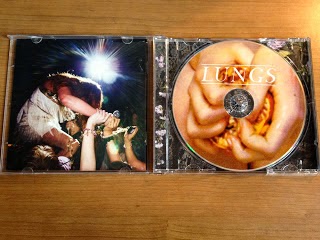
  • The CD cover for this album is contrasting with the cover; the saturation and hue of the CD cover is bright, orange and it stands out amongst the rest of the artwork on the album. The imagery is of a person squeezing a fig, and from the angle of the shot it seems as though that person is a child. This is interesting in that figs are known to be very prominent in religious contexts, and this album has a lot of religious undertones (as do a lot of Florence and the Machine's album). In the Bible, the fig is known as the Tree of Life, which reflects the idea that the front cover of the lungs represents life and beauty. 
  • The white writing of 'LUNGS' over the image on the CD is to remind the audience of the name of the album, although it's in white so as not to come across too strongly to the audience. This is because 'lungs' is written on the front cover of the album and is referred to with the sketch of the lungs on the back cover and so the artist may not want the audience to feel overwhelmed. It's in capitals and defined by being between two white lines to try and stand out from the back image however, because it needs to be read but it doesn't want to take all the attention away from the CD imagery and the pull out.
  • The pull out is similar to the front cover; dark colours with sections of white and paler colours to try and stand out. The context of the imagery - this girl being on someones shoulders at a concert of some sort - really contrasts with the rest of the album; having no direct link to lungs or life, this image stands out because it doesn't entirely make sense. She isn't looking into the camera, which makes it seem more natural and 'in the moment' rather than posed and forced. You can't see her face either which begs the question, who is this girl? She has similar hair and skin colour to Florence, but we can't know for sure (bringing mystery to the album, again). 
  • The relevance of the imagery on the pull out could be suggesting a carefree lifestyle, that she is 'breathing' metaphorically in that she is happy and enjoying the moment. This is something that the audience for the album would appreciate, as they too enjoy period where they can let go and 'breath'. 
  • Behind the CD is more artwork; although not clearly seen it seems to be an image of flowers similar to those on the front cover. This synergises with the cover because it links through nature and beauty - and then the fig on the CD in front also synergises with the idea of nature - and with the theme of life (through religious contexts).